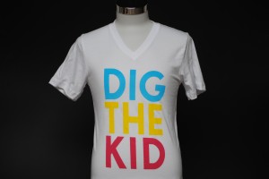
 Here’s a fun colorful print we did for an SF-based band. A trio of neon colors on white v-neck shirts (sunglasses not included). Here’s a fun colorful print we did for an SF-based band. A trio of neon colors on white v-neck shirts (sunglasses not included).
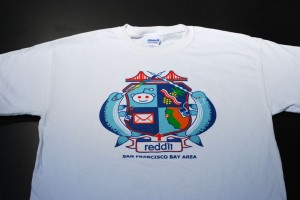
 Here’s a very colorful fun print we did for Reddit. Pretty much speaks for itself, eh? Here’s a very colorful fun print we did for Reddit. Pretty much speaks for itself, eh?

This six color design was a little more involved when printing, and came out beautifully.

Only two colors in this print, though still stands out thanks to the crisp artwork!

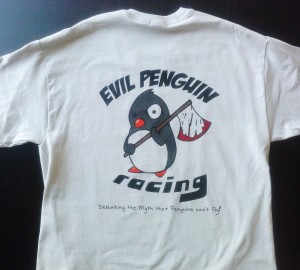
This is a nice, clean print we did for some motorcycle enthusiasts. 5-color print on ol’ trusty Gildan 2000 garments, and yes, we avoided getting on the bad
side of this particular penguin!
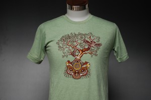
 Awesome 4 color super soft owl shirt Here’s a 4 color discharge print for the band Railroad Earth. Art and subject is awesome, and we
nailed the reproduction if I do say so myself. Super soft printing on super soft Alternative Apparel garments.

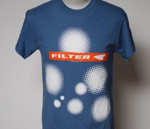
Three color (there’s a white underbase under all of that) print for the band Filter.
 Blam! Simple 3 color print showing off our waterbased and discharge screen printing. You literally can’t feel the ink on the fabric it’s so soft. Sun 30500 muted colors are our favorite. Blam! Simple 3 color print showing off our waterbased and discharge screen printing. You literally can’t feel the ink on the fabric it’s so soft. Sun 30500 muted colors are our favorite.
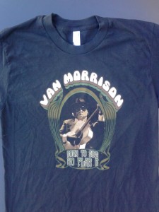
 Six color waterbased discharge print for the man himself. Six color waterbased discharge print for the man himself.
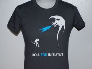
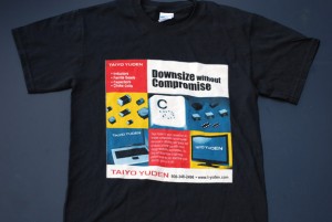
 Straightforward 2-color discharge print we did for an advertising company, complete with a flame-breathing dragon! Straightforward 2-color discharge print we did for an advertising company, complete with a flame-breathing dragon!
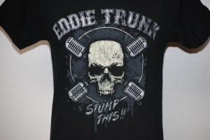
 Stump This! Two greys, two whites, and a bone color. Done son. Stump This! Two greys, two whites, and a bone color. Done son.
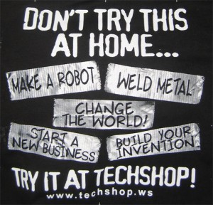
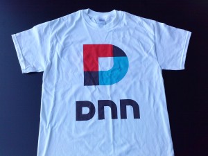
 two color duct tape print We’ve been printing shirts for TechShop, located in Menlo Park, CA, for a number of years now. Every year they exhibit at the annual Maker’s Faire and usually have some cool shirts to bring along. This year they went with a two color duct tape design on back as well as their logo on front. This was an interesting print to produce, trying to recreate the look of duct tape on a t-shirt.
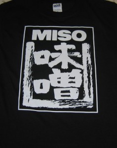
 Miso Shirts We love it when clients bring us food ideas to print. Especially when it’s a food we love. And we really, really like it when they bring a sample of the food with them!
This print was for the Japanese External Organization of San Francisco, promoting, you guessed it, Miso. They used our lighter weight shirts, as this was for marketing, and not workwear. It’s a great example of a good looking single color screenprint, using design and typography to create interest as opposed to multiple colors.
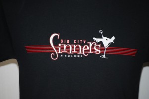
 One of the prints we did for the band Sin City Sinners, this guy is 4 colors including a trusty underbase to keep the colors bright on the dark shirts. One of the prints we did for the band Sin City Sinners, this guy is 4 colors including a trusty underbase to keep the colors bright on the dark shirts.
 Plastisol for the athletic look on this dude. As much as we love discharge inks, sometimes, they just don’t fit the art. Don’t need a credit card to ride this train… Plastisol for the athletic look on this dude. As much as we love discharge inks, sometimes, they just don’t fit the art. Don’t need a credit card to ride this train…
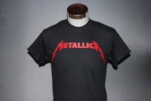
 Metallica! There’s an underbase in there to make sure the bright red stays bright; sometimes simple goes a long way. Metallica! There’s an underbase in there to make sure the bright red stays bright; sometimes simple goes a long way.
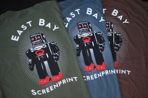
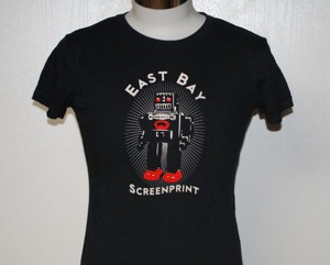
 Mr. Roboto strikes again! Mr. Roboto strikes again!
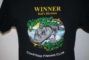
 We print things for this local fishing club from time to time, and this particular shirt was for a youth sturgeon derby event they held. 6 colors with a discharge underbase, and the winning fish even stands out a bit more thanks to the smooth gradients. We print things for this local fishing club from time to time, and this particular shirt was for a youth sturgeon derby event they held. 6 colors with a discharge underbase, and the winning fish even stands out a bit more thanks to the smooth gradients.
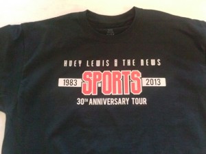
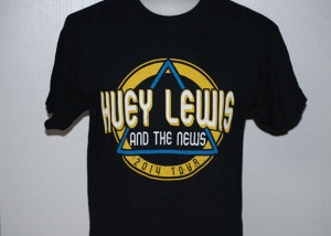
 More Huey Lewis! This fella’s a 3-color print plus a discharge underbase. More Huey Lewis! This fella’s a 3-color print plus a discharge underbase.
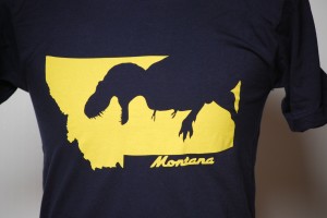
 Super soft custom dinosaur shirts One color discharge, super soft, so awesome. I mean,
really, check it out. You’ve got a t-rex, you’ve got the
state of Montana, you’ve got the colors of the state of
Montana and you’ve got a super soft print that can’t
be felt. If this was to be executed with plastisol you’d
have a big shield of sweaty plastic slowing you down
getting eaten by a t-rex. Sorry about your plastisol luck.
Designed by the totally rad “Dino” Danny Anduza.

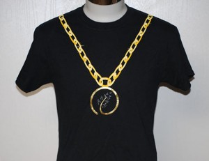
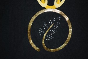
 This print was a bit more complicated than usual. In addition to the gold foil used for the medallion, the leaves in the center are made up of about fifty rhinestones for additional shine. Another interesting challenge was ensuring the placement of the print so that it would appear like a necklace, even going all the way up to the shoulders. Needless to say our client (and us of course) were very happy with how these turned out! This print was a bit more complicated than usual. In addition to the gold foil used for the medallion, the leaves in the center are made up of about fifty rhinestones for additional shine. Another interesting challenge was ensuring the placement of the print so that it would appear like a necklace, even going all the way up to the shoulders. Needless to say our client (and us of course) were very happy with how these turned out!
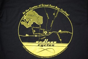
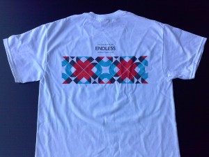
 This design is a recreation of a map pinpointing the location of a local bicycle shop. Not only does the fine detail make for a great-looking print, it also ensures an easy time finding Endless Cycle’s address! This design is a recreation of a map pinpointing the location of a local bicycle shop. Not only does the fine detail make for a great-looking print, it also ensures an easy time finding Endless Cycle’s address!
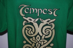
 We’ve printed shirts for the Celtic rock band Tempest for years, and for this run they wanted something a bit more eye-catching. We printed this design in gold shimmer, and added a drop-shadow effect as well. The shirts turned out amazing, making their 25th anniversary tour that much more special! We’ve printed shirts for the Celtic rock band Tempest for years, and for this run they wanted something a bit more eye-catching. We printed this design in gold shimmer, and added a drop-shadow effect as well. The shirts turned out amazing, making their 25th anniversary tour that much more special!
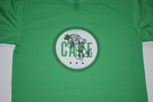
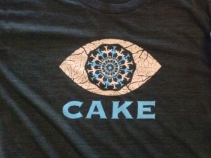
 Another print for the band Cake, this guys is two colors plus an underbase to make sure that “moon” shines! Another print for the band Cake, this guys is two colors plus an underbase to make sure that “moon” shines!

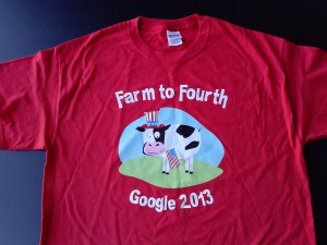
Here’s a fun, colorful print we did for Google’s 4th of July celebration. This bright and snazzy
seven color design was printed on Red Gildan 5000 garments. A super rush job (aren’t they all)
we had this turned around in 2 business days.

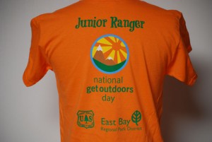
Five color design on Orange Gildan 5000 shirts, this one for the US Forestry Department and East Bay Regional Park District.
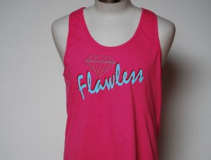
 Here’s a print we did for a local clothing line, two color waterbase on soft fashion tanks. Here’s a print we did for a local clothing line, two color waterbase on soft fashion tanks.
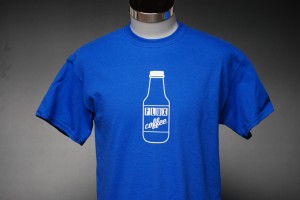
 Super soft waterbased white As much as we are always talking about the benefits of waterbased and discharge printing, they do have
some limitations. One of those is that certain colored fabrics do not react with discharge inks and will
not print properly. Royal blue is one of those colors, and if we were to print this shirt with standard
discharge white, the end result would be a powder blue print. HIGH SOLID ACRYLICS TO THE RESCUE!
Pictured above is our new super opaque white waterbased ink. This is not a discharge product, and
will sit on top of the fabric as opposed to in it. It does have more hand than a discharge print, but
the feel is super smooth and soft compared to plastisol. It’s really neat stuff and we are one of only
a handful of shops offering it.
This print was a perfect candidate, Berkeley based Flux Coffee ordered several different colored shirts
for their order and one of them was Royal, so we discharged the rest and used our opaque waterbased
white for the royal. Result – perfection. (Good art always helps there too!)

3 colors, plus an underbase to keep the red and yellow inks nice and bright. These were run plastisol, as royal is on the list of garment colors that don’t react well with discharge printing.

Here’s a great 3 color design on American Apparel Royal blue shirts.
Royal Blue shirts typically do not discharge well,
but we wanted to keep a softhand and bright
colors, so we used what’s known as a discharge
underbase. This means that under all of the top
colors is a layer of waterbased discharge ink that
removes most of the color of the fabric so that
the top colors will be bright.

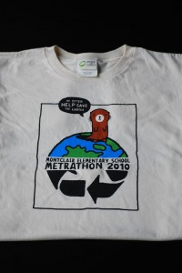
Here’s a 4 color waterbased print on light shirts
that we did for the Montclair Elementary Metrathon.
We used Port and Company Organic cotton shirts,
and waterbased inks. Not only do these shirts have
a very nice feel, this is arguably the most
environmentally friendly way to screen print
t-shirts.
Of course, great artwork always helps as well.

We printed these shirts using 4 color process on White and Ash Gildan 2000 shirts.
4 color process is a print method of using only 4 colors (Cyan, Magenta, Yellow and blacK, CMYK)
to reproduce many different shades of additional colors. It works well for photographs
and colorful artwork, on white and light shirts.
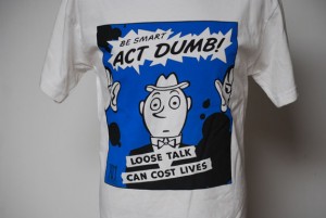
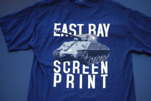
 Five color waterbased discharge designed and printed in house. Going for a 1920’s propaganda feel, the tank literally pops off the garment. It’s awesome. Five color waterbased discharge designed and printed in house. Going for a 1920’s propaganda feel, the tank literally pops off the garment. It’s awesome.
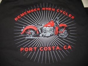
 Remember When Cycles Shirts Steve, the owner of Remember When Cycles, Port Costa California, contacted us to produce a design for his new business. We came up with the image pictured above, and Steve loved it. He had us print it on our Heavyweight shirts, as we all know how tough those bikers can be.
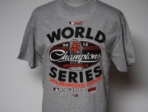
 2012 SF Giants World Series Champions Tee Hey, remember when this happened? We sure do! For most folks it meant an exciting home team win.
For us it meant that plus printing from the second they won the game until early the following morning,
non-stop. Hot market they call it, and it’s a whole new ball game. Lowish meshes and plastisol inks for
exact color matches and the fastest printing possible. We can run at 2000 pieces an hour under the right
conditions. Luckily we don’t have to do that often. If you are from the bay Area and own one of these
shirts chances are good it passed through our shop. Quickly.
Go Giants!
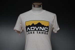
 Here’s a 5-color print on some American Apparel tri-blend Oatmeal tees. These were printed as waterbase, with a very soft hand. Here’s a 5-color print on some American Apparel tri-blend Oatmeal tees. These were printed as waterbase, with a very soft hand.
 3 color plastisol print Sometimes plastisol makes sense. While discharge and waterbased printing has been around for a long
long time, it has only recently become increasingly popular for custom t-shirt printing. Early metal
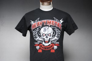
shirts were certainly not discharged, and many a hesher would be terribly disappointed with anything
less than a full front shield of bright plastisol. So why make hesher’s sad?
We don’t. We love discharge, but it’s only a tool in the box. Plastisol still has it’s purpose.
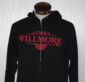
 Single color discharge print across the zipper Here’s a single color discharge print across the zipper for the Fillmore. Pretty neat!

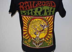
Here’s a 4 color discharge print, this one of a large and colorful tour tee for the band Railroad Earth.
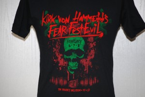
 3 color discharge printing for Fear Fest It’s all right there. This is a 3 color halftoned discharge print for the Bay Area Fear FestEvil.
Not a whole lot to say except look at that red! Ridiculously bright! That’s how we roll!
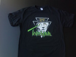
 Winger 25th Anniversary print. Plastisol on this guy, as there were American Apparel tri-blend shirts up in the mix. 6 colors, in house seps ya’ll. Winger 25th Anniversary print. Plastisol on this guy, as there were American Apparel tri-blend shirts up in the mix. 6 colors, in house seps ya’ll.
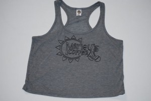
 A nice little print we did on some tanks for a local coffee shop, those that frequent the Farmer’s Market may have even seen these in person. A nice little print we did on some tanks for a local coffee shop, those that frequent the Farmer’s Market may have even seen these in person.
 Three color plastisol, again due to tri-blend fabric. We’ve got some tricks to keep that fuzz down though. Three color plastisol, again due to tri-blend fabric. We’ve got some tricks to keep that fuzz down though.
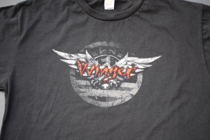
 Here’s a three color distressed print we did for a Winger reunion promotion, complete with a weathered/vintage feel, waterbased Here’s a three color distressed print we did for a Winger reunion promotion, complete with a weathered/vintage feel, waterbased
discharge inks on Sun Apparel garments. Yeah buddy!
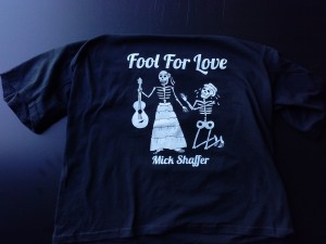
 White Discharge print on black shirts, super soft! Here’s a waterbase discharge print for Bay Area musician Mick Shaffer for his CD release a few years back. Fresh from the wayback machine!
You may have noticed that we talk about and display waterbased and discharge printing a lot, there’s a reason for this; in many cases it is far
superior to the “standard” plastisol inks used by many printers. We’d like to think that it should be the other way around. Waterbased prints
are softer, brighter, won’t crack or chip, and best of all they breathe! After washing a shirt printed with waterbase/discharge ink you won’t be able
to feel the print at all. What’s not to like about that?
 Little three color discharge from the archives. Dig it. Little three color discharge from the archives. Dig it.
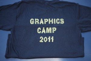
 An interesting 2 color print, this design almost appears 3D on the shirts. Waterbased discharge makes for a super soft print you can’t even feel on the An interesting 2 color print, this design almost appears 3D on the shirts. Waterbased discharge makes for a super soft print you can’t even feel on the
garment. This particular job from the archives was for Google’s Android graphics camp.
 Another one from the way-back machine. 2 color waterbased sleeve print on Sun natural color garments. If you drink juice this might look familiar. Another one from the way-back machine. 2 color waterbased sleeve print on Sun natural color garments. If you drink juice this might look familiar.
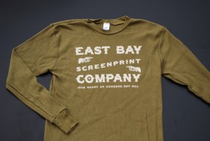
 Another design we printed for ourselves, this design came out very nice and clean. Not always an easy feat on thermal garments! For this we used straight discharge base on Royal Apparel %100 cotton thermals. This allows us to get down into the waffling of the fabric and still maintain a soft breathable print. See if you can find the typo… Another design we printed for ourselves, this design came out very nice and clean. Not always an easy feat on thermal garments! For this we used straight discharge base on Royal Apparel %100 cotton thermals. This allows us to get down into the waffling of the fabric and still maintain a soft breathable print. See if you can find the typo…
 Waterbased discharge again here. 5 colors made this project feasible, whereas with plastisol the color count would have made the project not cost effective. Waterbased discharge again here. 5 colors made this project feasible, whereas with plastisol the color count would have made the project not cost effective.
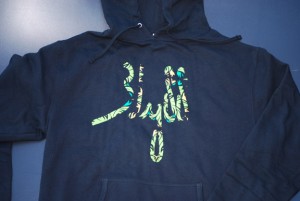
 This three color print came out great, and thanks to the underbase the “jungle” appears even more vibrant! This three color print came out great, and thanks to the underbase the “jungle” appears even more vibrant!
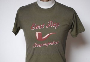
 Here’s a classy print we did for ourselves a while back, 3 color discharge on darker color garments for a vintage-y feel. Here’s a classy print we did for ourselves a while back, 3 color discharge on darker color garments for a vintage-y feel.
 While this print is about a year old, it really represents the colors of that time, NEON!!!! This shirt is for the Exploratorium, which if you’re a Bay Area native, needs no further explanation. While this print is about a year old, it really represents the colors of that time, NEON!!!! This shirt is for the Exploratorium, which if you’re a Bay Area native, needs no further explanation.
 This is a 2 color print for a local clothing line. We used plastisol for this print as it was going on a bunch of different colored shirts, some of them non-dischargeable. This is a 2 color print for a local clothing line. We used plastisol for this print as it was going on a bunch of different colored shirts, some of them non-dischargeable.
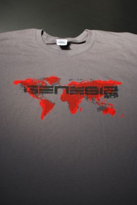
 This print is made up of two different inks. The red background is waterbased discharge, our secret mix that results in a very bright red that washes well. On top of that is black plastisol. We went with plastisol for the black as we wanted the print to have a bit of gloss to it to stand out from the ground, Gildan 5000 Charcoal shirts. This print is made up of two different inks. The red background is waterbased discharge, our secret mix that results in a very bright red that washes well. On top of that is black plastisol. We went with plastisol for the black as we wanted the print to have a bit of gloss to it to stand out from the ground, Gildan 5000 Charcoal shirts.
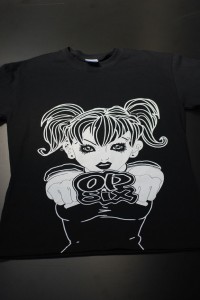
 This here is an oversized white discharge print for Op Six clothing company that extends over the bottom seam and off the edge of the shirt. This here is an oversized white discharge print for Op Six clothing company that extends over the bottom seam and off the edge of the shirt.
Here’s a nice 4 color plastisol print for an animation company. He literally looks like he’s jumping off the shirt!

Yet another oversized waterbase/discharge
(noticing a trend?) print for an MMA clothing
line. Simple 2 color on Alstyle/AAA shirts.

Here is a 4 color oversized waterbased discharge
print we did for a local high school club. There are
not many shop that print waterbased discharge,
and if this particular print had been executed
using standard plastisol inks the result would
have been like wearing a heavy shield on your
chest. Waterbased discharge inks actually
become part of the fabric, and after washing can
not be felt by the hand. They are also bright and
breathable, which makes them preferred for many
designs.
 Oversize over the seam and off the bottom of the shirt printing All over and off the bottom of the shirt with a single color makes for an interesting
and inexpensive print.
 Here’s a neat three color waterbased design we printed recently. We really like waterbased inks as the end result is super vibrant and soft. The ink Here’s a neat three color waterbased design we printed recently. We really like waterbased inks as the end result is super vibrant and soft. The ink
actually becomes a part of the fabric, and once the garment is washed it can’t be felt.

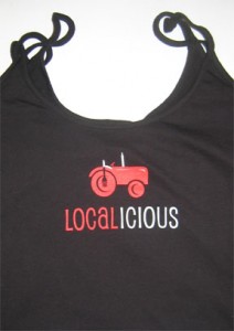
 Localicious Tank Tops 2 color screen printed design on Anvil 325 spaghetti strap tanks.
Good design and a judicial use of colors makes for exciting and inexpensive shirts.
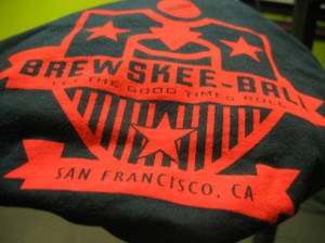
 BrewSkee Ball! We’ve now printed 2 seasons of these BrewSkeeBall
shirts. We use both Gildan and American Apparel
shirts, and a bright single color water based discharge on both.
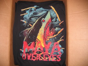
 Maya Over eyes This here is an awesome 4 color print for the band Maya Over Eyes from San Jose. This was printed using the simulated process method, which uses the blending of specific base colors to create the effect of many more colors and shades. This is a popular screenprinting method with bands that want to print their often photographic type album covers on dark shirts. Of course the print would not be as great if it weren’t for the incredible artwork to begin with.
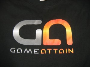
 Four color print for Game Attain East Bay Screenprinting recently printed these shirts for Game Attain. This particular print is a good example of halftoning used for gradient and fade effects in screen printing. This is an area that other printers often struggle with, but we’ve got it down. On this particular screen print, we used a 355 mesh screen that allows for very fine detail to be held. 65 Lines Per Inch means that even up close, the individual halftone dots can be hard to see.
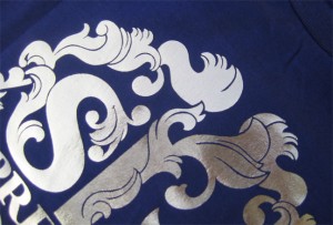
 Custom Foil Screen Printing on Shirts Here is an example of our foil work. Foil is an interesting embellishment method that can be used to add a special effect to printed shirts. There are limitations to the process however, and most garments should be hand washed if possible. Foil comes in a wide variety of colors and can be used with other effects for nearly limitless combinations. Contact us with your ideas for for a quote today.
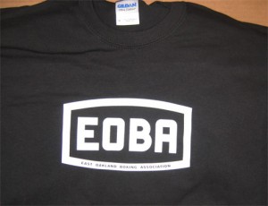
 East Oakland Boxing Association We printed these shirts for the East Oakland Boxing Association. A simple clean white print on Black and Kelly Gildan 2000 shirts. The bottom text is reversed out and smaller than 10 point, and we held the detail just fine.
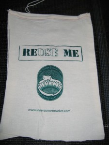
 Custom Printed Tote Bags We printed 1000 of these reusable tote bags for the Inner Sunset Farmer’s Market. A very simple one color print with a great design makes for an inexpensive promotional handout.
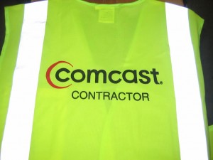
 Printed Safety Vests We recently screen printed these safety vests for a company that does contract work for Comcast Cable out of the South Bay, near San Jose . They went with a 2 color logo on our green Economy Safety Vests.
|
|
 Here’s a fun colorful print we did for an SF-based band. A trio of neon colors on white v-neck shirts (sunglasses not included).
